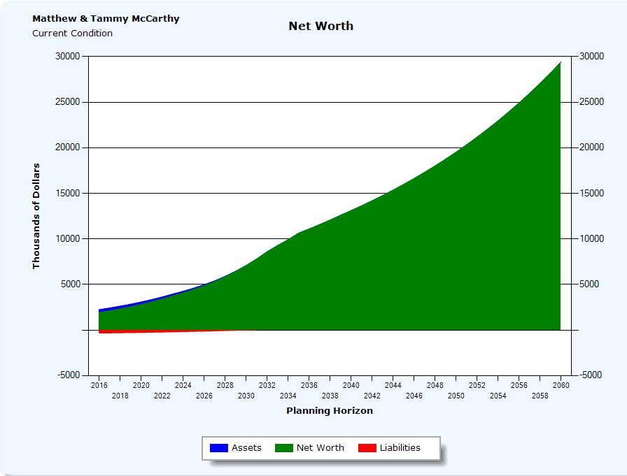
Net Worth Graph
The Net Worth Graph illustrates a year by year projection of the client's asset's liabilities and net worth.
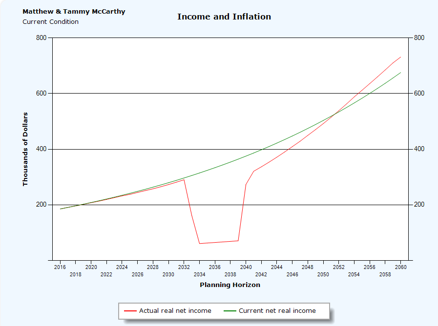
The Income vs. Inflation Graph is a line graph that illustrates a year by year projection of a client's Current Real Income (gross income less taxes) inflated at the entered inflation rate vs. the Actual real income (the year by year gross income less taxes).
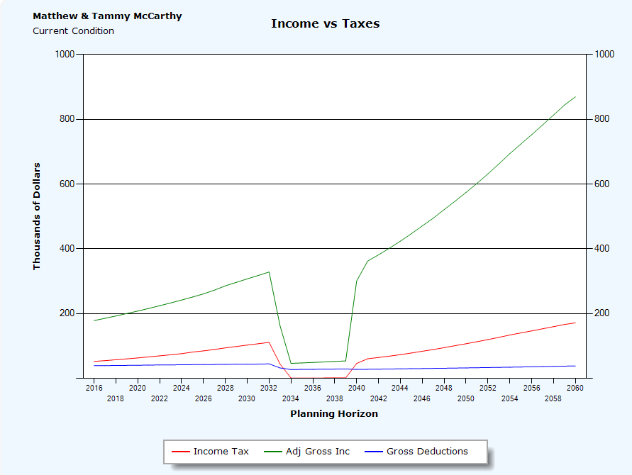
The Income vs. Taxes Graph is a line graph that illustrates a year by year projection of a client's Adjustable Gross Income AGI (this encompasses all taxable income, including Capital Gains, Qualified dividends, distributions from Qualified Plans including Minimum Required Distributions (MRD), interest income, Social Security income (Express automatically calculates the taxable portion of Social Security) and non passive business income). The Gross Deductions includes mortgage interest, charitable contributions (express does the 50% AGI limitations), real estate tax, etc.). The Income Tax is the annual Federal Tax due including and self-employment tax.
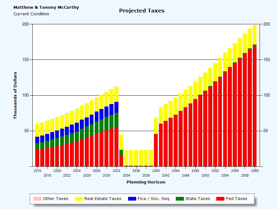
The Sources of Taxes Graph is a stacked bar graph that illustrates a year by year breakdown of what and how much taxes the client pays. The Federal taxes due include Self Employment tax, AMT, EIC, and taxes on the taxable portion of Social Security benefits. FICA includes the Medicare and Social Security taxes. State taxes include state and local taxes calculated and entered.
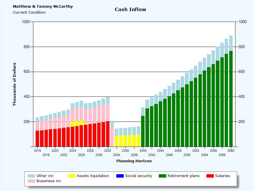
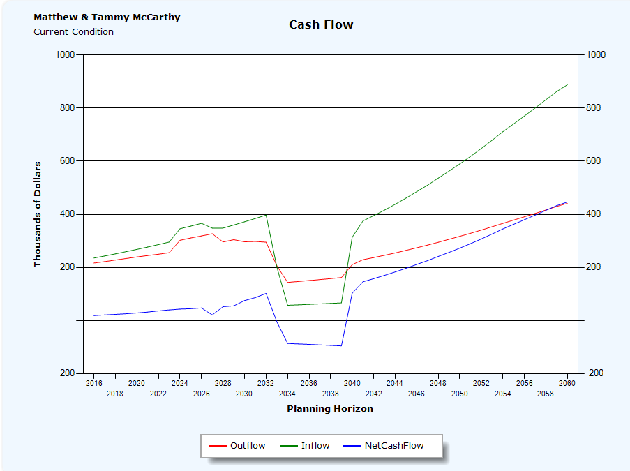
The Cash Inflow Planning Horizon Graph illustrates a year by year stacked bar graph projection of a client's sources of cash inflows. The total annual values include Salaries (Income for both spouses), Social Security income (both spouses), Business income (self employed income for both spouses), Retirement Plans (income from both spouses 401ks, IRAs, Roth IRAs, SEPS, Keoghs, and all other qualified and non-qualified plans), Asset liquidations, (cash received from the sale of investments such as CDs, Money Market accounts, Stocks, Mutual Funds, and Bonds), and Other Income (this includes gifts received, life insurance proceeds, and business interest such as rental property).
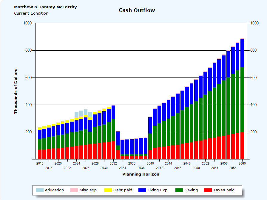
The Cash Outflow Planning Horizon Graph is a year by year stacked bar graph projection of a client's uses of cash. These include Taxes Paid (real estate, self-employment tax, FICA (Medicare tax and Social Security tax), state income taxes and additional local taxes), Living Expenses, Misc Expenses. Savings (including 529 plan contributions, 401k, IRA, and Roth IRA contribution including any Catch up contributions), Debt paid (mortgages and any other amortized personal debt), and Education expenses.
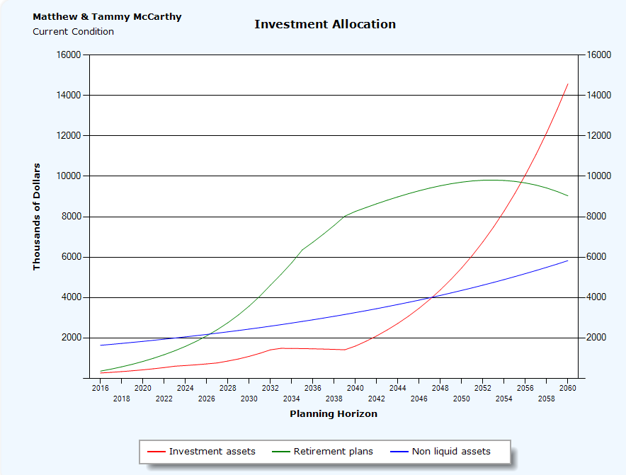
The Investment Allocation Graph illustrates a year by year line graph that projects the client's liquid investments, retirement plans and their non-liquid assets. This graph is useful for assessing if a client has sufficient assets throughout the planning horizon to meet their retirement needs. The Investment Assets include, cash accounts, 529 Plans, equities, and bonds. The Retirement Plans, include, 401ks, IRAs, Roth IRAs, and any other qualified or non-qualified retirement plan. Non-liquid Assets include, your home, personal assets, business interests, and cash value life insurance.
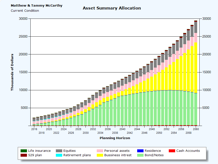
The Asset Allocation Planning Horizon graph illustrates a year by year summary of how the client's assets are allocated. This is a stacked bar chart that allocates asset balances on a year by year basis. The asset groups for this graph are Cash Accounts, Equities (stocks, mutual funds and excess cash), Business interests, Retirement Plans (includes IRAs, Roth IRAs, 401k Plans, and all other qualified and non qualified plans), Residence, Life Insurance (Cash Value life insurance and any entered ILITs), Bonds (including MUNI/s, corporate and treasury bonds), 529 Plans, and all other personal assets.
The Net Cash Flow Graph is a line graph that illustrates the year by year difference between the client's cash inflows and cash outflows.
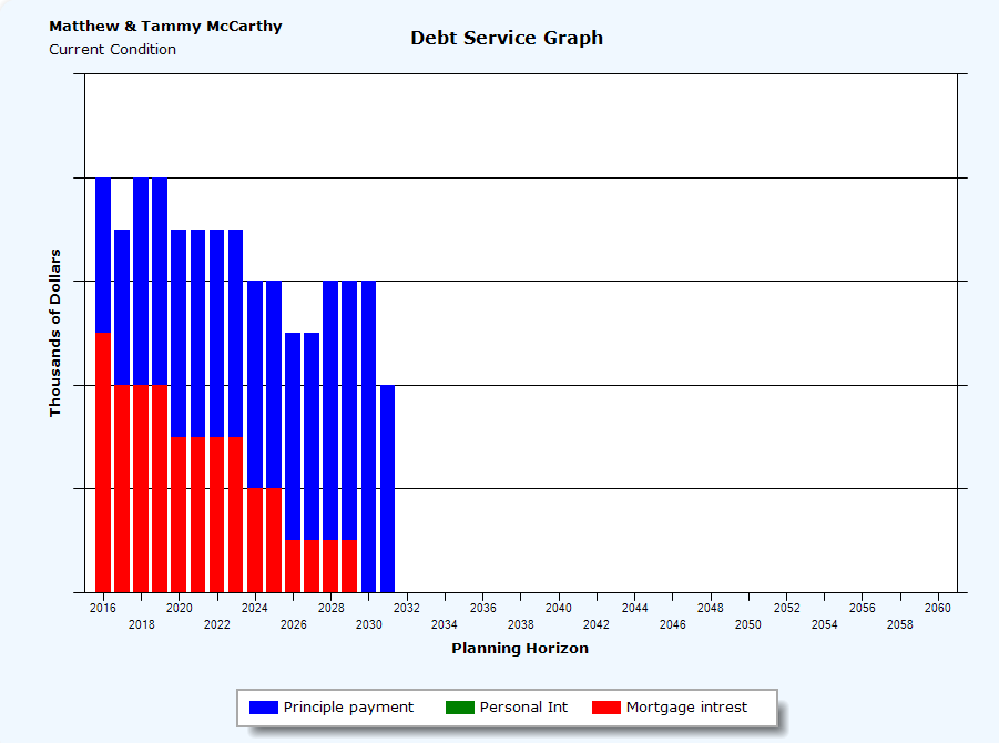
The Debt Service Analysis Graph illustrates a year by year projection of a client's sources of liabilities as a percentage of their cash inflows. The three types of debt include mortgage interest, personal interest and investment interest.
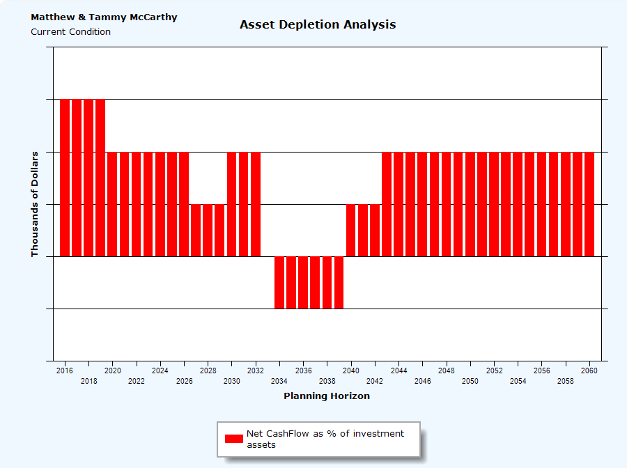
The Asset Depletion/Accumulation is a bar graph that illustrates a year by year analysis of what percentage of a client's cash flow is either consuming assets (negative amount) or contributing to investment net worth growth (a positive amount).
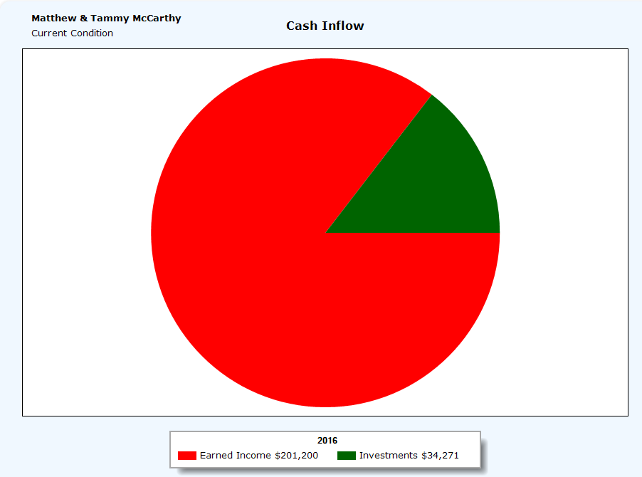
The Cash Inflow Pie chart is a 3D pie chart that illustrates the present year client's sources of Cash inflow . This includes, the present year values for Social Security Income, earned income, investment income, and tax free income.
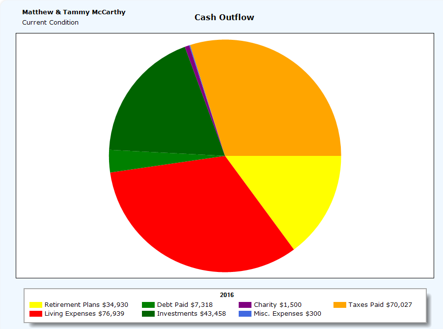
The Cash Outflow Pie chart is a 3D pie chart of the current year's total expenses. These include Living Expenses, Investments (including 529 plan contributions), Taxes Paid (real estate, self-employment tax, FICA (Medicare tax and Social Security tax), state income taxes and additional local taxes), Retirement plans (401k, IRA, and Roth IRA contribution including any Catch up contributions) Charity, Debt paid (mortgages and any other amortized personal debt), Misc Expenses.
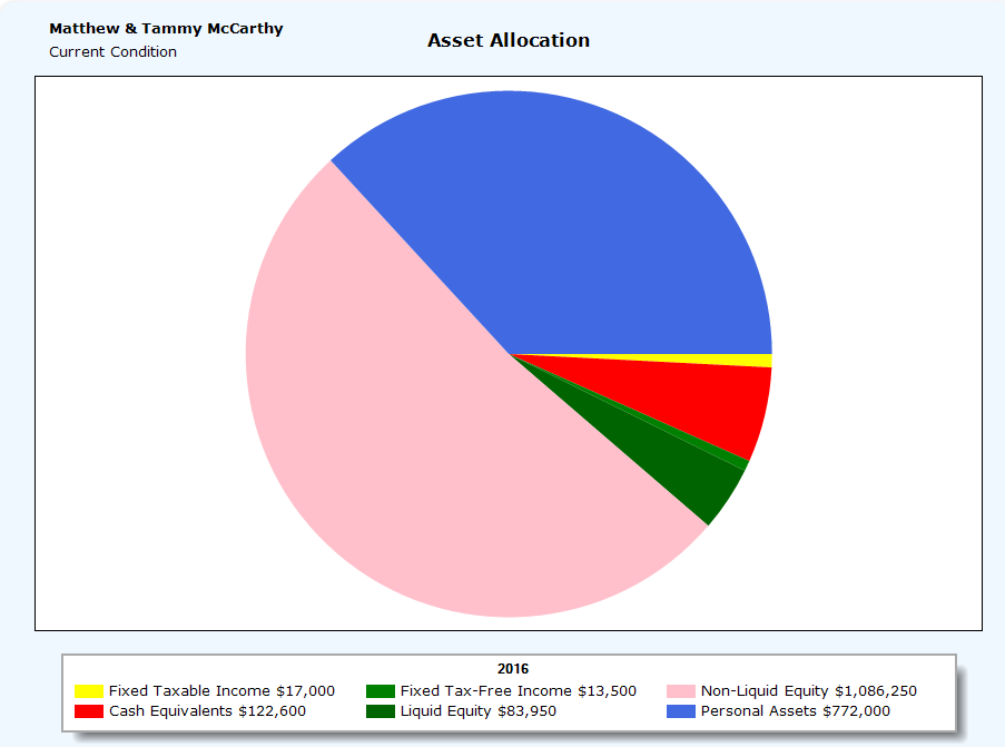
The Asset Allocation Pie chart illustrates the present year allocation of the client's current asset holdings. This is a 3D pie chart that reflects the client's assets based on liquidity, type of asset, and type of income it may generate
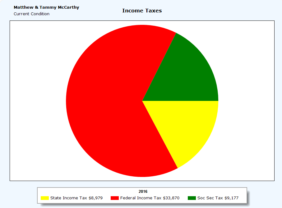
The Income Tax Pie chart is a 3D pie chart of the client's present year's tax liabilities. The Federal Income tax includes, AMT, FICA, and any self employment tax. The total federal tax amount also include and carry forwards, Earned Income Credits, and Child Care credits if applicable).
The Estate Distribution Pie chart is a 3D illustration of the present year client's estate taxable insurance and net assets (after reduction of liabilities).
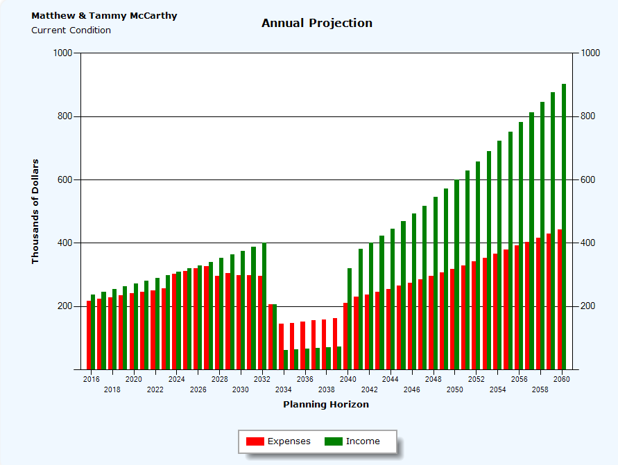
The Income vs. Expenses Graph is a bar graph illustrating the clients Expenses vs. income. Different from the Net Cash flow graph in that Income does not include the sale of investments, and expenses do not include the investment of assets.
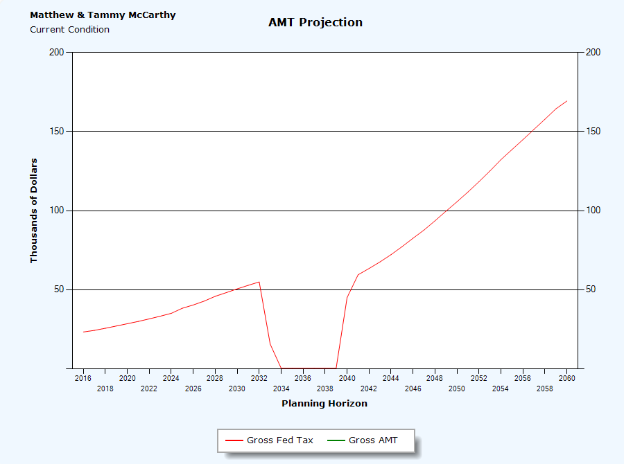
The AMT Analysis graph is a line graph that illustrates the year by year Gross Federal Tax due vs. the AMT tax due (the client pays the higher of the two). |